


OMEGA x Swatch MoonSwatch
The OMEGA x Swatch MoonSwatch keeps the Speedmaster-inspired profile and reinterprets it through Bioceramic, colour and astronomical references. Mission to the Moon remains the version closest to the original lunar aesthetic, while the other Missions change the dial, case and colour details. Comparing the models therefore means seeing the same architecture through very different visual identities.
12 products
OMEGA x Swatch: what sets the MoonSwatch collection apart
The OMEGA x Swatch MoonSwatch takes a structure that is immediately recognisable in watchmaking and reinterprets it through materials, colours and astronomical references. The case profile, tachymeter scale, pushers and subdial layout recall the language of the Speedmaster Moonwatch, while Bioceramic and colour palettes take the project in a completely different direction.
The strength of the collection lies precisely in the repetition of this architecture. The different Missions share the same overall shape and layout, but alter the case, dial, hands and strap enough to create very distinct identities.
A MoonSwatch should therefore not be chosen only according to the planet it is named after. Colour, contrast between dial elements, reference configuration and special details determine how different two models can feel despite belonging to the same family.
Within the selection of collectible watches, MoonSwatch represents an approach in which chronograph design is transformed primarily through material and colour.
Mission to the Moon: the closest reference to the Speedmaster
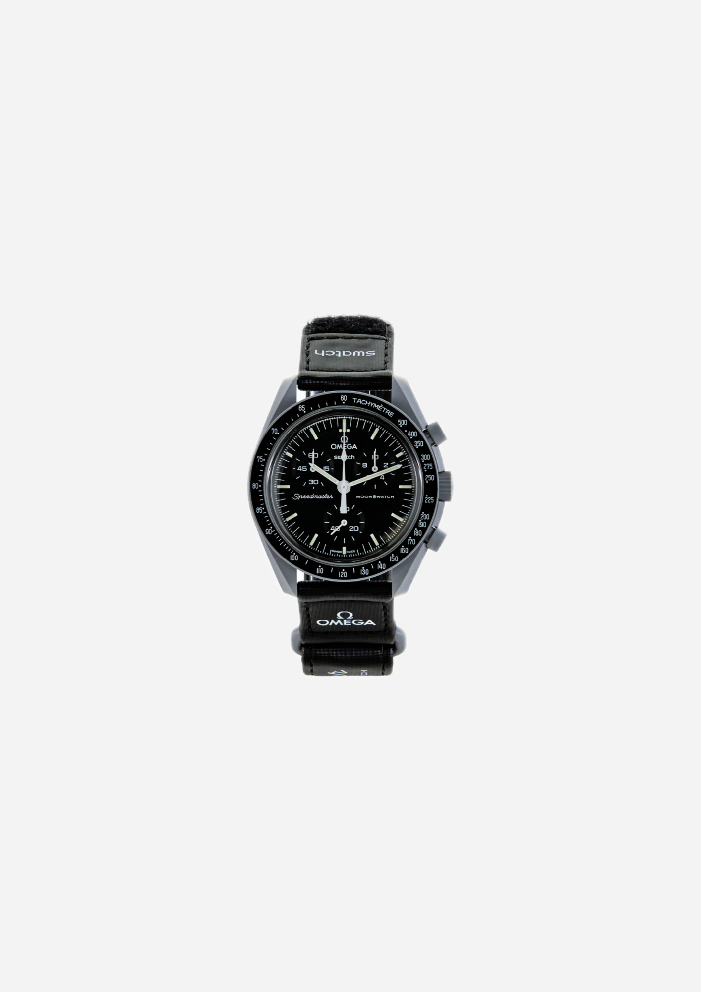
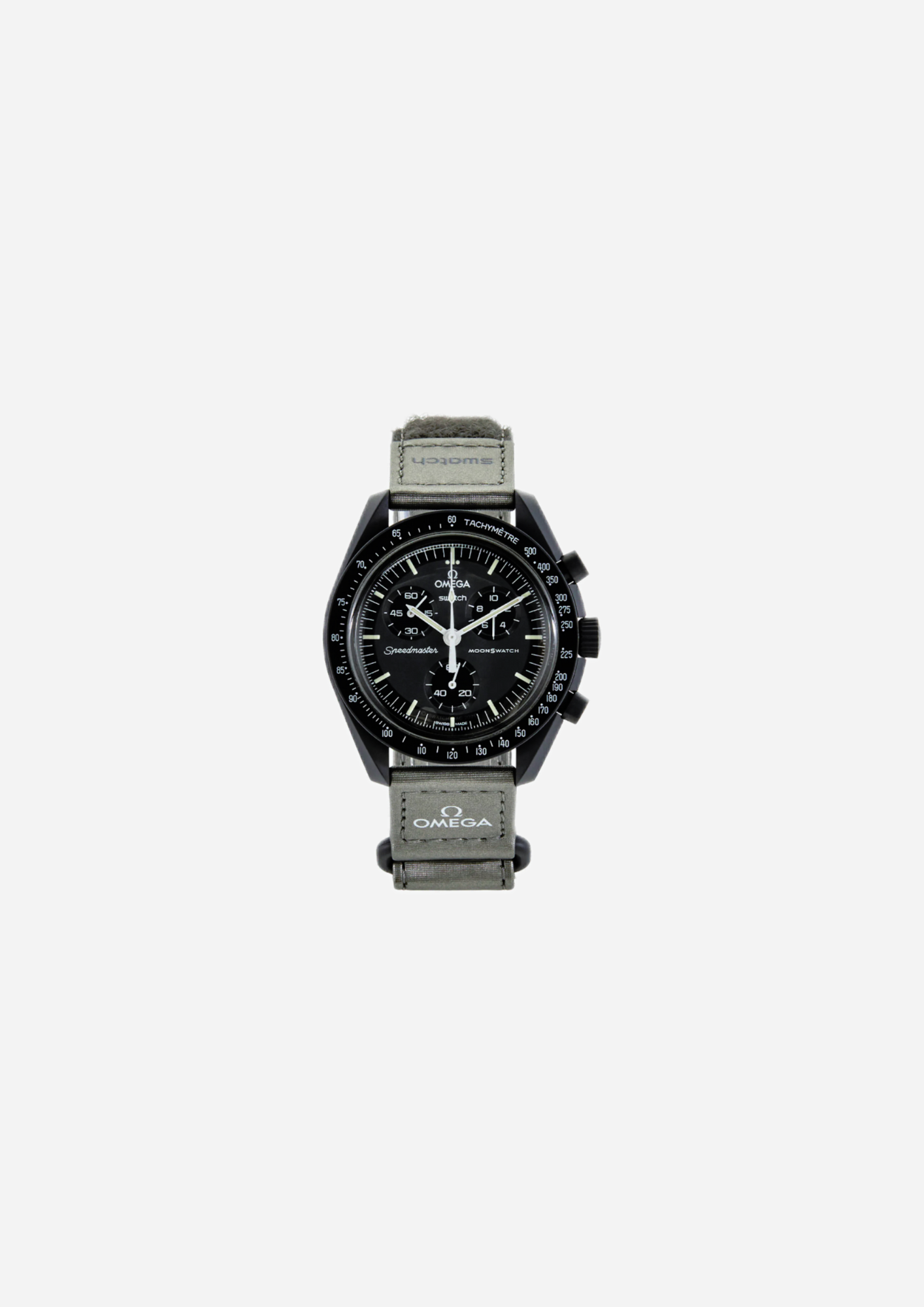
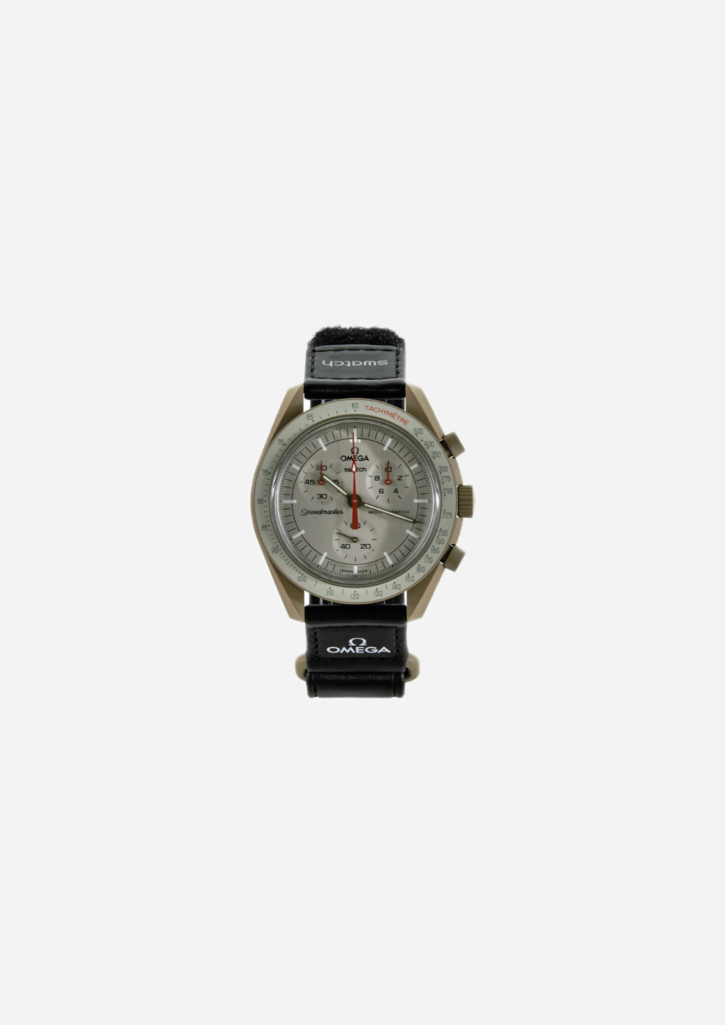
Mission to the Moon is the most immediate reference point for understanding the collection as a whole. Its grey tones and dial layout maintain a more direct visual link with the Speedmaster than the Missions built around brighter colours.
The structure remains typical of the MoonSwatch: chronograph case, three subdials, side pushers and tachymeter scale. Colour, however, gives this version a more restrained character and allows the case proportions to stand out more clearly.
For this reason, MoonSwatch Mission to the Moon can be a natural choice for those who appreciate the collaboration but prefer a less colour-driven configuration.
Mission to the Moon also works as a useful point of comparison with the rest of the range: moving to Mercury, Neptune, Venus or Uranus immediately shows how much the same construction can change through a different combination of case, dial and details.
The Missions and their colours: from Mercury to Neptune
The different Missions turn the solar system into a colour palette.
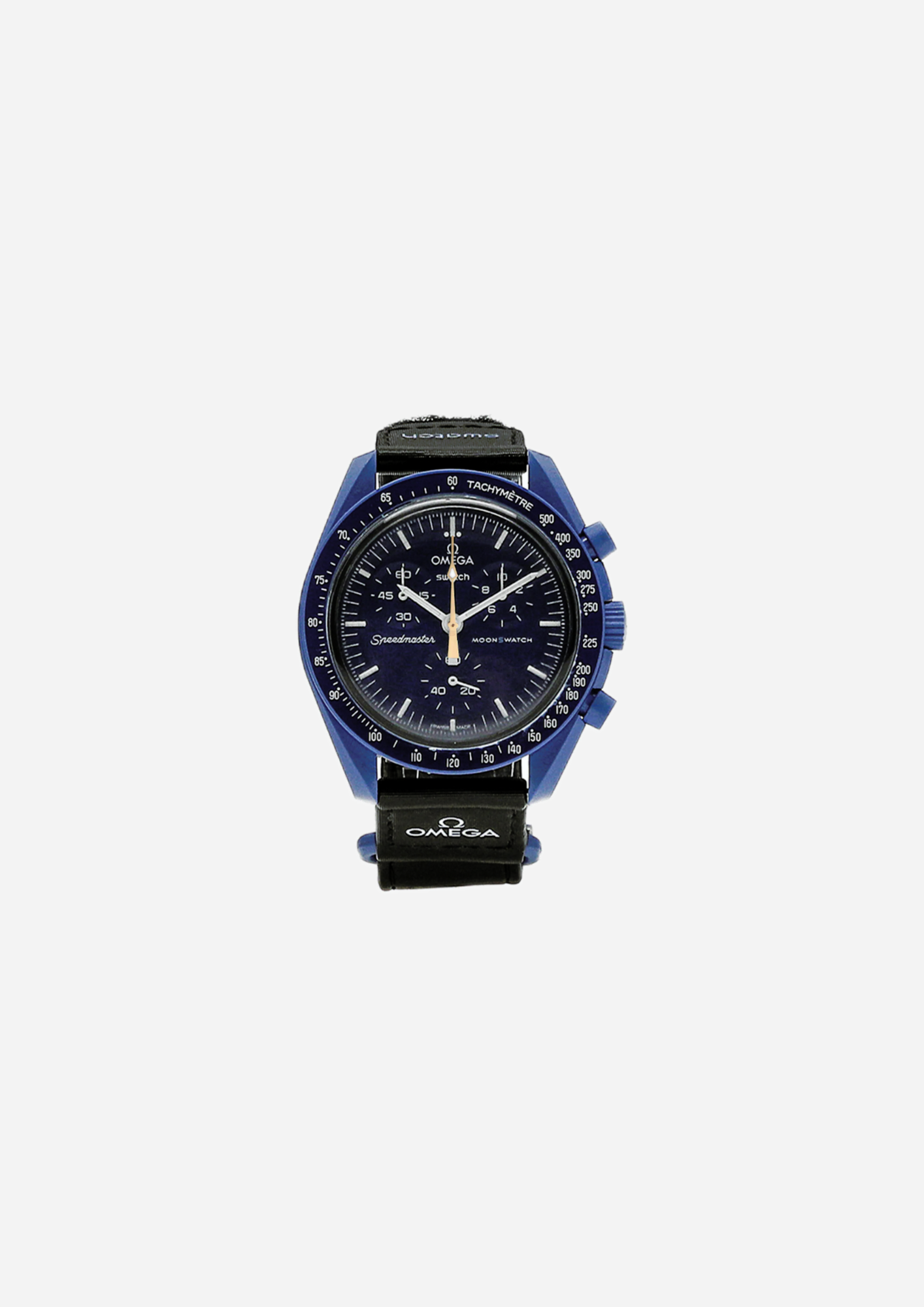
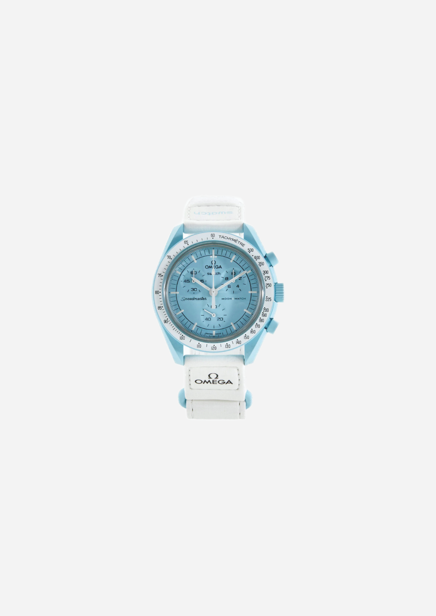
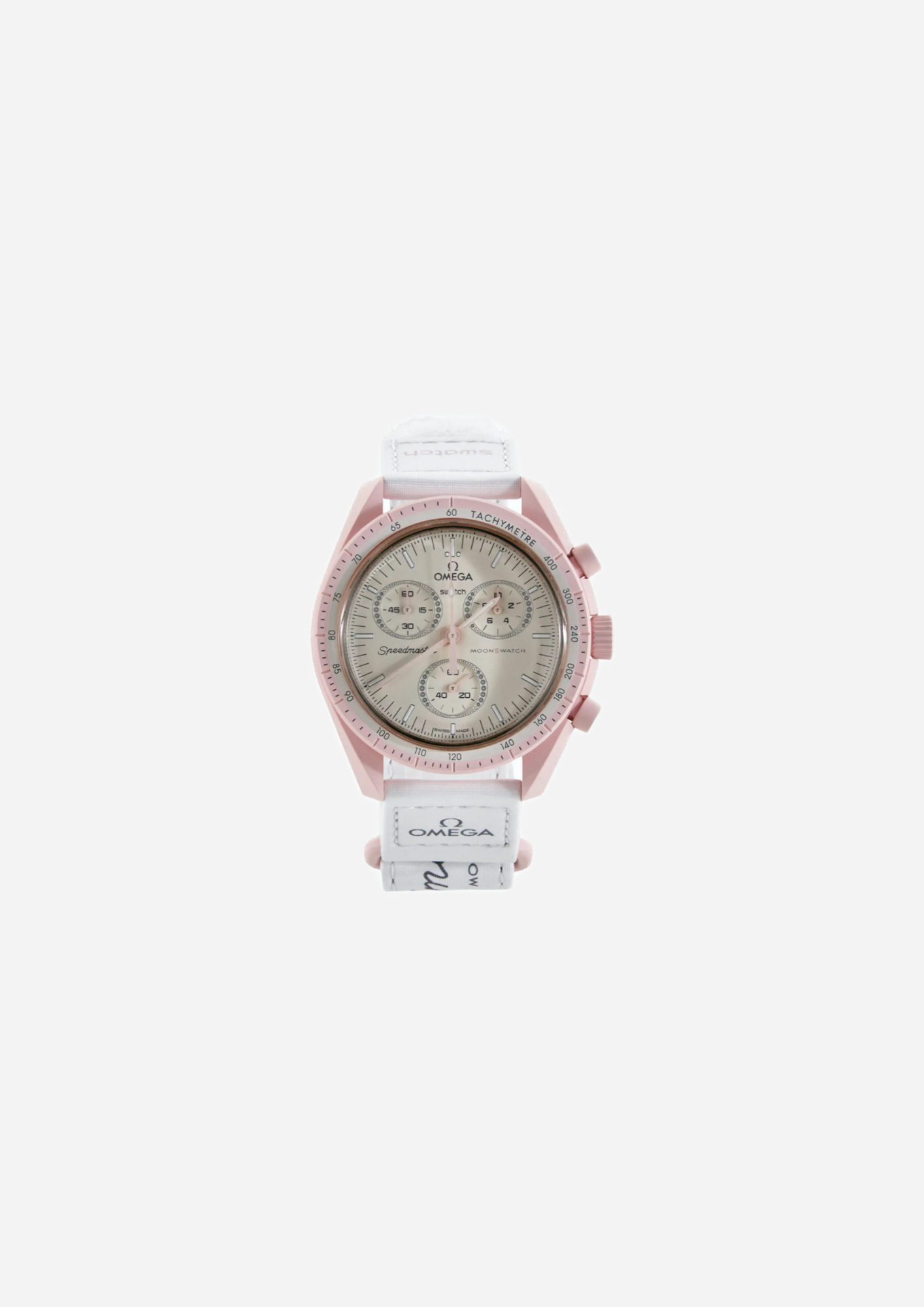
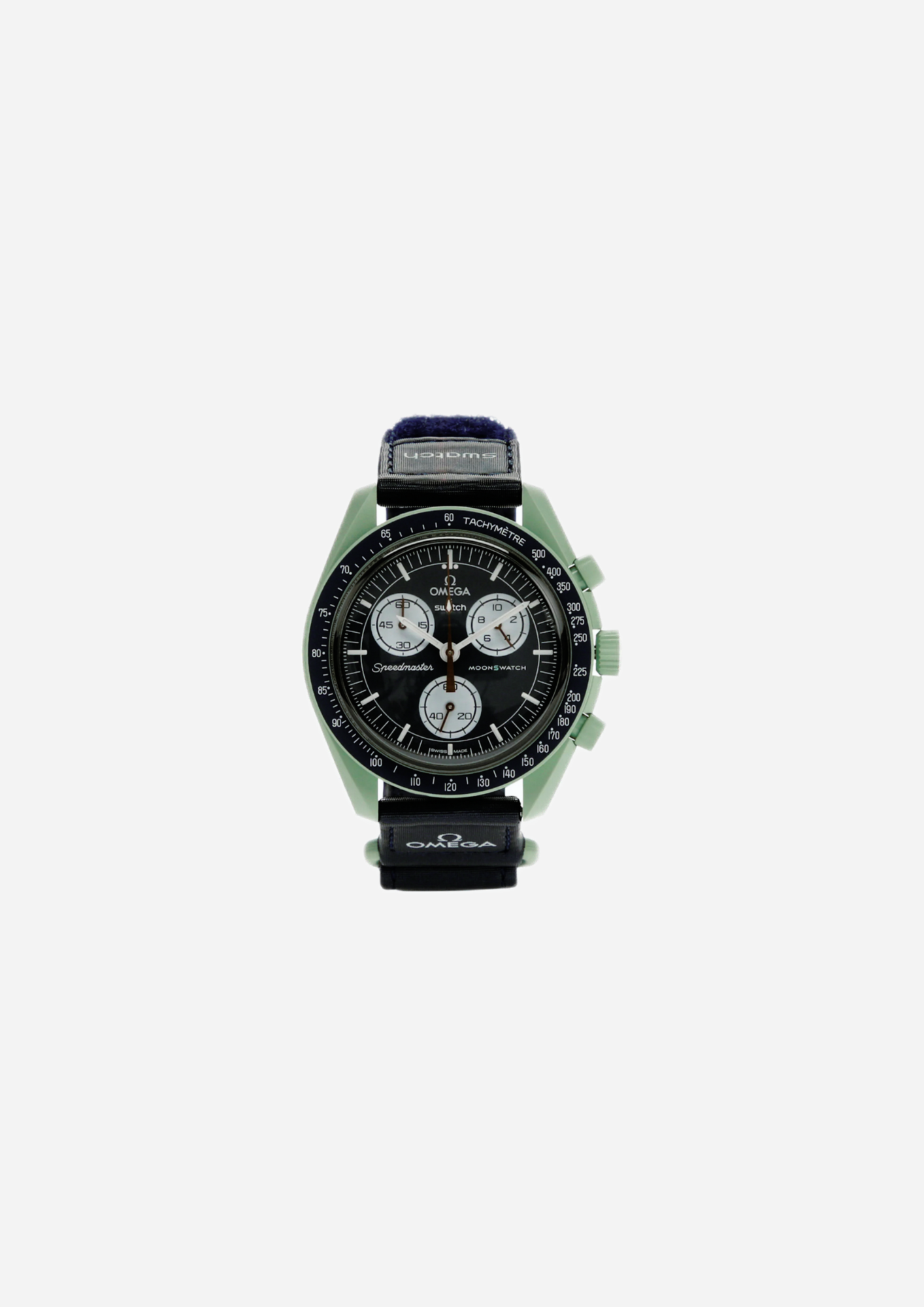
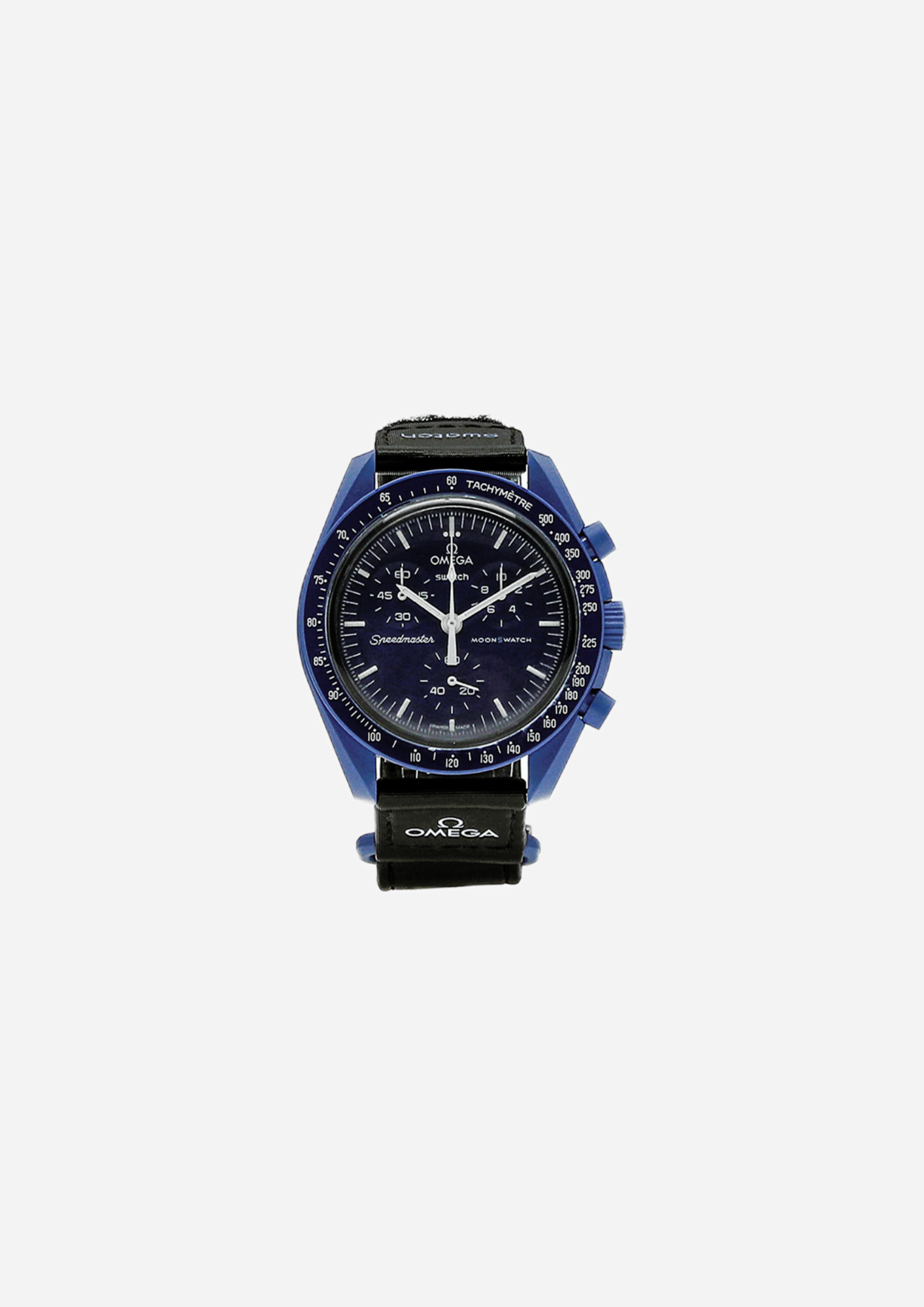
Mission to Mercury uses darker, higher-contrast tones, while Mission to Venus moves the dial towards pink. Mission to Uranus works with pale blues and Mission to Neptune develops a deeper, almost monochromatic blue.
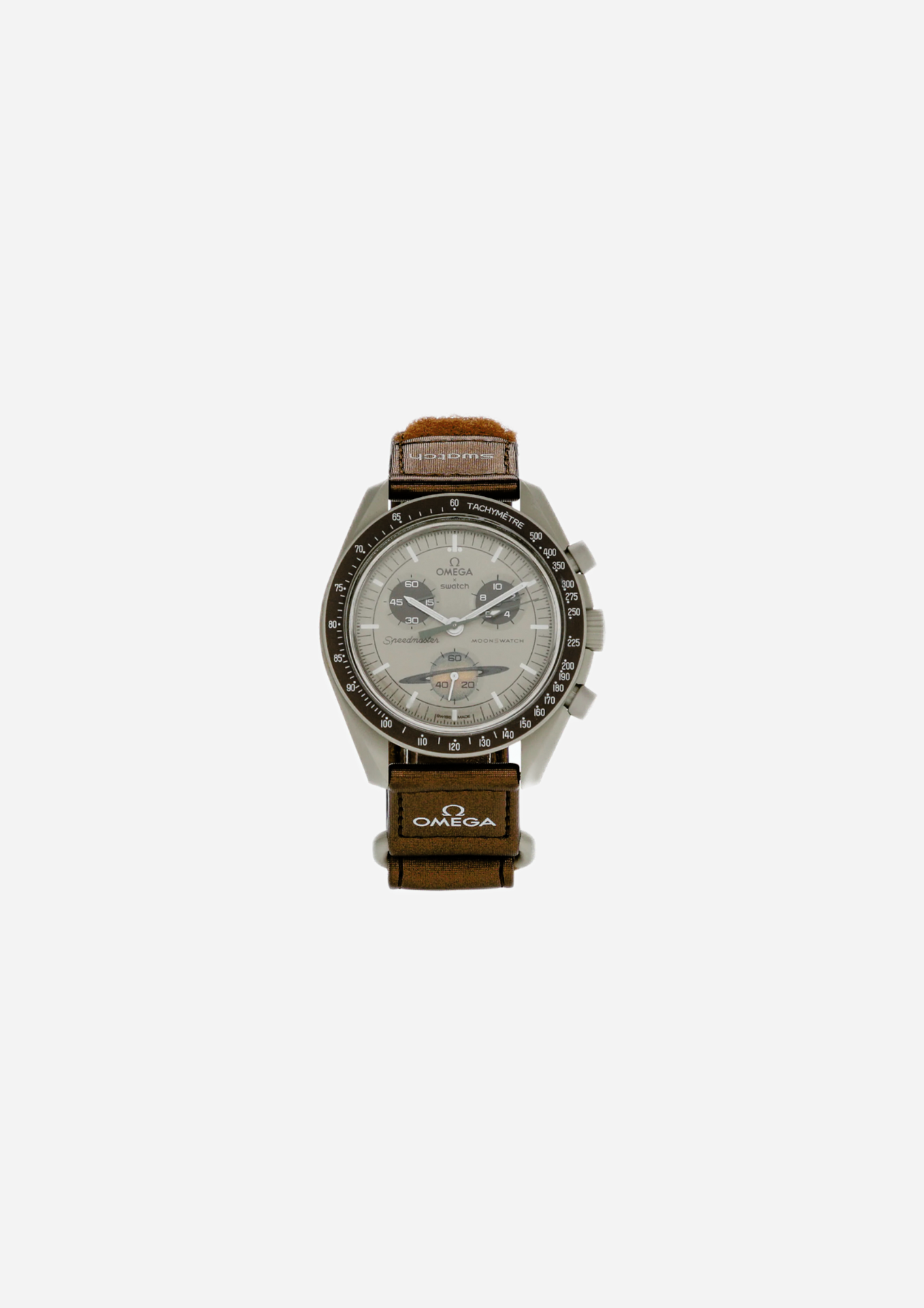
Mission on Earth combines shades associated with Earth, while Mission to Jupiter uses a warmer palette. Mission to Saturn introduces one of the collection's most recognisable graphic elements through the reference to the planet's rings in the subdial at six o'clock.
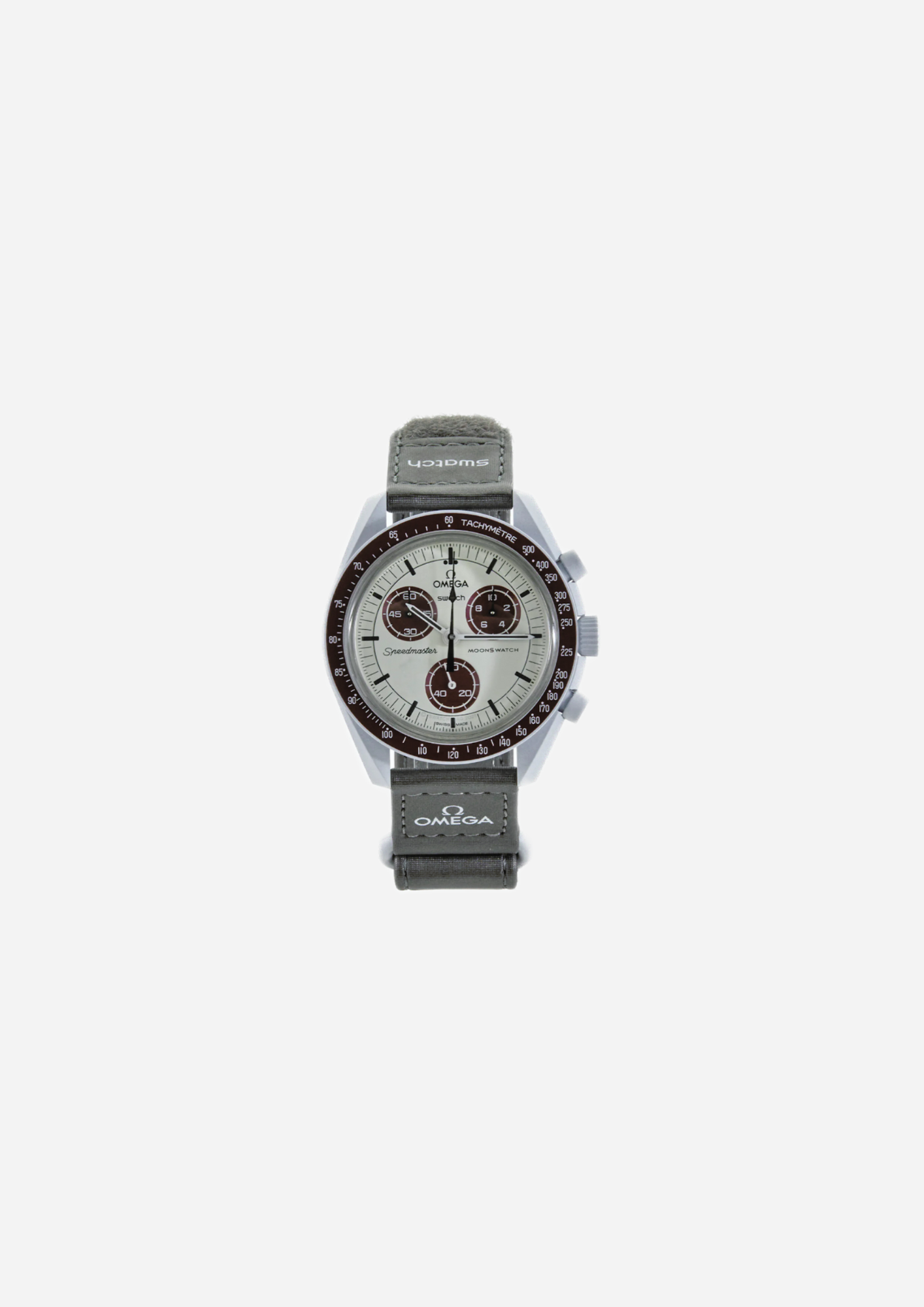
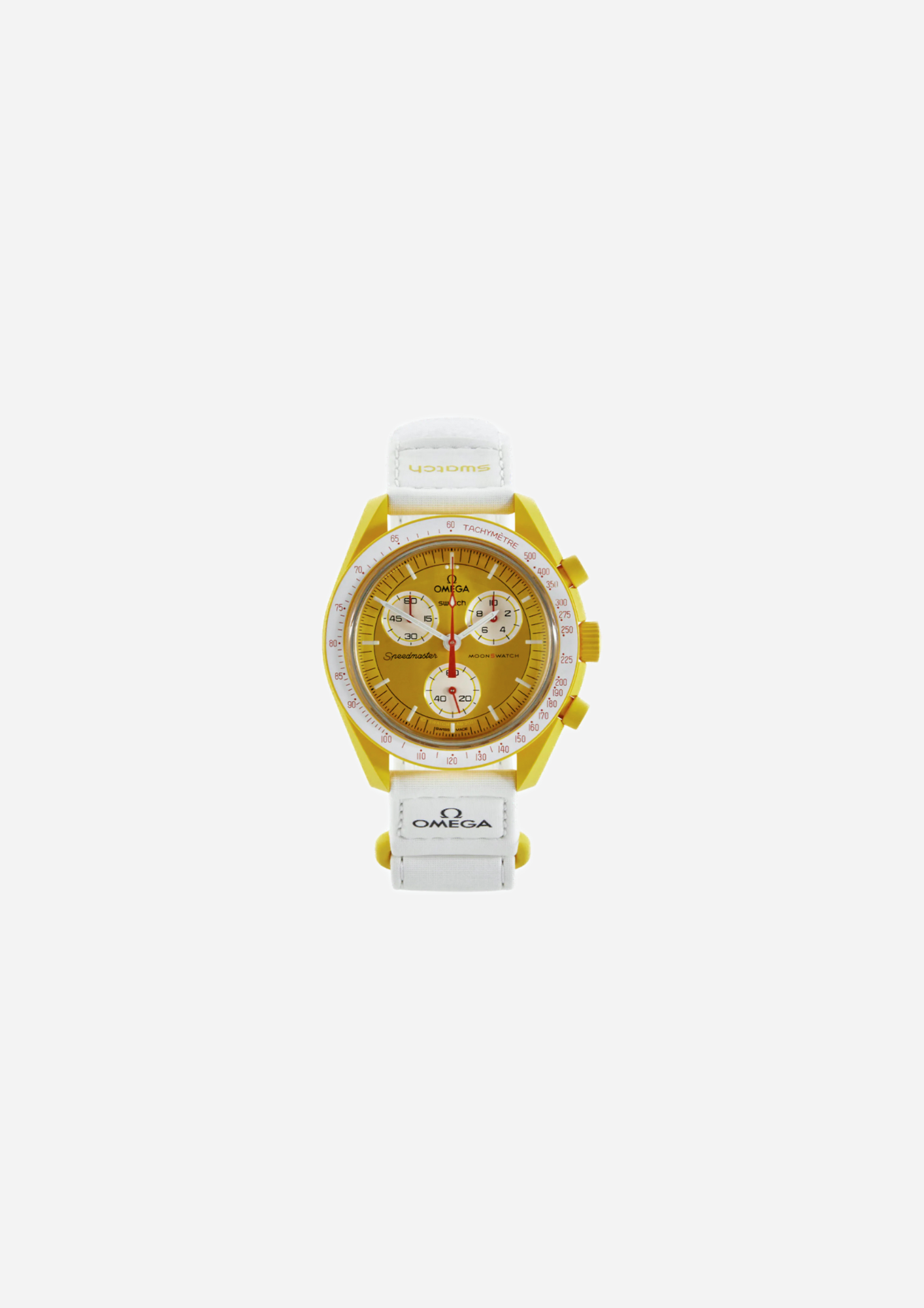
Pluto works with contrasts between neutral tones and burgundy, while Mission to the Sun takes the same architecture towards a much brighter surface.
The difference between these versions should therefore not be reduced to “blue, pink or yellow”. Colour is distributed across the case, dial, subdials, hands and strap and changes the overall balance of the watch.
Some Missions favour a relatively uniform result, while others create far more visible contrasts. The choice should therefore start from the complete composition rather than a single element.
Bioceramic and construction: why a MoonSwatch looks different from a metal chronograph
One of the elements that most clearly defines the Bioceramic MoonSwatch is the case material. Swatch uses a composition made predominantly from ceramic with a bio-sourced component, creating a smooth, matte surface that is very different from the steel traditionally associated with many chronographs.
Bioceramic also changes the way colour is rendered. Shades such as pale blue, pink, yellow or deep blue are perceived directly through the case and become a structural part of the design rather than a coating applied over metal.
The matte surface also reduces reflections and makes the shapes of the case, pushers and bezel easier to read.
The material should nevertheless be considered together with the rest of the watch. Dial, strap, subdials and graphic details complete each specific Mission and explain why two MoonSwatches built on the same base can have very different wrist presence.
Moonshine Gold: when the reference becomes part of the story
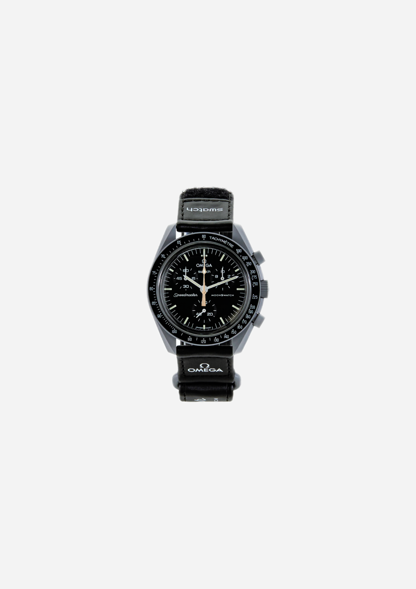
Moonshine Gold interpretations add another layer to the MoonSwatch family through a chronograph seconds hand treated with OMEGA Moonshine Gold and details associated with specific editions.
In these versions, the distinguishing value does not depend only on the base colour combination. The specific reference, the period connected with it and the design of the hand also become important.
Versions such as Blue Moon use a colour base linked to Mission to Neptune, while other interpretations start from the more neutral layout of Mission to the Moon. The result remains immediately recognisable as part of the MoonSwatch collection while introducing details that distinguish a specific edition from standard Missions.
Anyone looking primarily at the collectible side should therefore pay close attention to the full name and reference rather than treating Moonshine Gold as a simple colour variation.
How to choose a MoonSwatch
To choose an OMEGA x Swatch MoonSwatch, start from the type of wrist presence you want.
Mission to the Moon and Mercury favour tones closer to those of a classic chronograph; Neptune, Uranus, Venus and Sun take the project towards more visible colours. Jupiter, Saturn and Pluto sit between these directions with warmer palettes or specific graphic details.
The second criterion is the reference. Two models from the same family can differ in dial, hands or special details, particularly when Moonshine Gold editions are involved.
The strap and its contrast with the case also contribute to the overall impression. The Mission name is therefore useful for orientation, but the best choice comes from comparing case, dial, colour, details and specific version.
If you want to compare the MoonSwatch with a completely different interpretation of the contemporary watch, the Royal Pop collection instead explores modularity and the very way the object is worn.
When purchasing online, MilanoMarktPlace explains the process used to verify selected items before sale on the dedicated product authenticity page.